Real Time Weather Mapping with mPING

mPING weather display

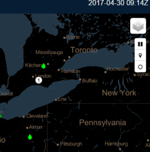
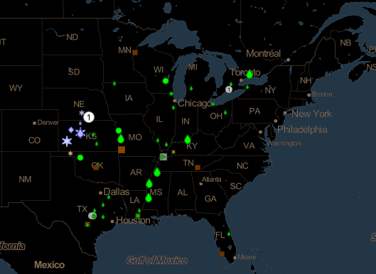
mPING, a real-time weather application, offers interactive insight into what is really going on with the weather in any location around the world. Users can access the app to either anonymously submit reports of current weather at their own location or view reports from others by downloading the app from iTunes or Google Play. All reports are shown through a repeating display over a specific time frame with an icon designating the specific type of weather such as rain, drizzle, snow, flooding, wind, and hail. The same map of the reports can also be accessed online at the mPING website. The image above is a screenshot from the mPING website of recent weather in the midwest. 

The app was launched in 2012 by developers from NOAA’s National Severe Storms Laboratory and University of Oklahoma and the Cooperative Institute for Mesoscale Meteorological Studies to assist in fine-tuning weather forecasts. According the the NOAA website, NOAA National Weather Service (NWS) forecasters can access the reports on their office workstations. This allows them to "overlay mPING reports with other data such as radar and satellite observations to aid them in their decision-making." Also the site reports that "television stations and private weather companies have the opportunity to build the ability to submit and display mPING submissions in their own branded applications, making the information available to the public in new ways."

Some tips to keep in mind while viewing the map:

  • The time frame displayed is over a three-hour period, and the time clock in the upper right corner is set to Greenwich time. (As an aside, per the NWS website: "All aspects of meteorology are based upon a world-wide 24-hour clock called Zulu time (Z), more commonly called Coordinated Universal Time (UTC). You will notice all weather maps, radar, and satellite images all have their time expressed in "Z". The Zulu term stems from military usage while Coordinated Universal Time is the civilian term for this 24-hour clock.")
  • You can start and stop the play of the weather reports by clicking the play/pause button in the upper right. This is the top button in the vertical line of three buttons located under a layer button.mPING menu buttons
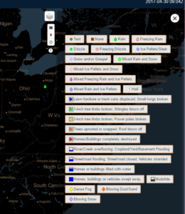
  • A legend for the icons can be found by clicking the middle button in the vertical line of three buttons located in the upper right of the screen. Below is a screenshot of the legend which will slide out after clicking this button. This legend also shows the type of reports which can be submitted. (Click the image for a higher resolution view.)mPING Icon Legend
  •  The bottom button in the vertical line of three buttons can be used to turn on and off the history of weather. Turning it on means that over the three-hour display all weather events will remain showing in the display. Turning it off means that as the weather plays out over the three-hour time period shown, you will only see weather reports at the time they were reported.
  • The layer button at the very top of the upper right of the screen allows the user to change to a topographic background instead of the black default background shown here.
Share

3D Printing for Civil Engineers

3D Printer

3D Printer
3D printer
Lately I've been thinking our field might be missing out by not exploring the opportunities offered by 3D printing. Even though 3D printers have been around for many years, I haven't seen anything significant related to its use by agencies or firms in our field. I remember a 3D printer in use in a classroom at the college where I used to teach and that was at least 13 years ago. But that printer was used by the mechanical drafting students – not those in the civil technology field. So my partner and I have embarked on the goal of learning more about 3D printing and how the technology can be used in the civil engineering field.

Fortunately we found a learning program hosted by the University of Illinois in Champaign-Urbana which also happens to be our alma mater. The program is offered through Coursera and is a series of 5 courses leading to a specialization certificate in 3D printing. We began the first course right at the start of 2017 and are almost finished with the second one. So far the content has provided a good introduction to 3D printing and offered ideas about how it has been and could be used in many different fields.

Near the end of the second course, we were introduced to Josh Ajima, a teacher in Northern Virginia. In his presentation, he described how he created 3D representations of the earth's topography to visualize how different areas of a watershed relate. A description of his work with fabricating the Chesapeake Bay Watershed can be found in his article, "Design Challenge: Chesapeake Bay Watershed." Civil engineers can see right away how 3D printing an area's topography can lead to better understanding of watersheds, flooding impacts, material transport, and other related concepts.

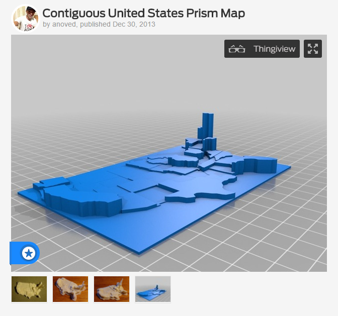
Then, in our effort to learn more about the local 3D printing community, we attended a workshop at the Maker Lab in the Harold Washington Library in Chicago. There we saw a printout of the topography of the bottom of Lake Michigan. We were also introduced to the idea of using 3D printing to display data. An example of this type of use can be found on a 3D printing site called Thingiverse where the user anoved has uploaded a model of the United States to be used to visualize data sets for the states. A screenshot of anoved's Thingiverse page with the map is shown below. We can imagine an agency using this model for public education to show the amount of transportation funding spent by each state or the number of highway fatalities or miles of roadway.

Thingaverse Example of US 3D printed map with data

I'll continue to share our experiences with 3D printing as we learn more about the technology and increase our understanding of how it might fit into civil engineering. In the meantime, if you are interested in learning more, I'd encourage you to check out the classes on Coursera – they are free to take if you are not interested in earning a certificate for the specialization. You can also visit Maker Labs in your own areas – they are usually found in most larger cities, particularly in libraries. Also, if you know of any uses of 3D printing in our industry, we'd love to hear about them – just drop us an email, comment below, or reach out to us on social media.

Share

Mapping the Accessible Path

Access map screenshot showing sidewalk steepness at 0.5%

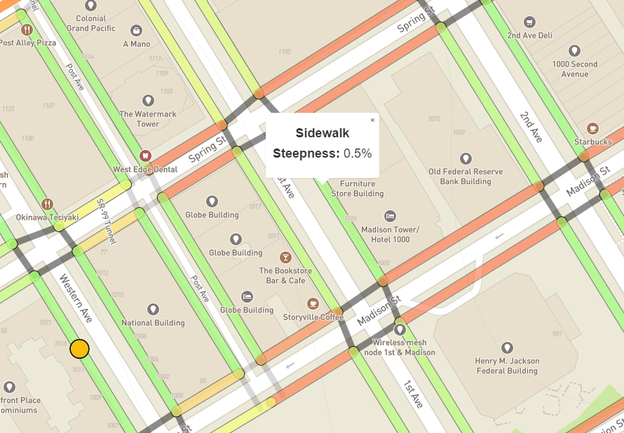
Access map screenshot showing sidewalk steepness at 0.5%The Data Science for Social Good (DSSG) team, a group out of the University of Washington, has been involved in an effort to improve mapping of the pedestrian way. By making use of the work from the OpenSidewalks project, they created AccessMap – a trip planning tool for people with limited mobility. With this tool, people can find the most accessible path through a network of sidewalks connected by curb ramps and street crossings.

At this time, the tool has only been implemented in Seattle, but the group plans to expand to other locations. The data used for the project is a compilation of the following elements with sources noted:

  • Base map – OpenStreetMap (OSM)
  • Sidewalks and curb ramps – Seattle Department of Transportation
  • Street crossings – DSSG Team
  • Elevations – National Elevation Dataset, USGS

When a user clicks a sidewalk segment, the steepness or grade is displayed. The screenshot of the map above shows a sidewalk segment along 1st Avenue between Madison and Spring streets at a 0.5% grade. Sidewalk segments are also colored coded to indicate the grade with red exceeding the required 5%, yellow just below the requirement, and green meeting the requirement. Clicking a street crossing or crosswalk displays the steepness or running grade along with a "Yes" or "No" to indicate whether or not curb ramps are at the corners.

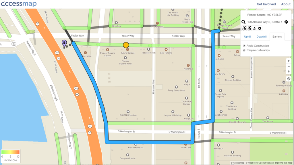
To plan a route using the map, the user types in their origin and destination in a manner similar to how other mapping programs work. The difference is that Accessmap has a drop down tool for the user to designate a limit for maximum uphill and downhill grade and the need to avoid construction and require curb ramps. Different mobility assisted devices such as wheelchairs or canes can also be designated. Below is an example of a planned route.

Planned route example on accessmap

Share

Using GIS to Assist in Recent Illinois Tornado – Related Emergency Response

Recently in Illinois several communities unfortunately experienced extensive tornado damage. And over the last week I've seen several GIS-related efforts set up to offer information that could be helpful to those working to recover and rebuild. Below are a few quick summaries of these efforts:

OpenStreetMap

According to their website, OpenStreetMap is "a free, editable map of the whole world. Unlike proprietary datasets like Google Map Maker, the OpenStreetMap license allows free access to the full map dataset." So basically, this online map and the related data are available to anyone and can be edited by anyone. It's been useful over the last few years in helping communities experiencing disasters. One of my favorite examples of how this has been implemented is the assistance that was offered after the Haiti earthquake a few years ago. If interested, you can check out a video showing the timelapse of the OpenStreetMap edits for the Haiti effort here: OpenStreetMap Project Haiti

Last weekend, one of the cities in Illinois that experienced the most damage was Washington, Ill. Soon after relief efforts began, I noticed Dave Smith, a GIS professional from the Washington, DC, area had started an effort to map all the structures in Washington, Ill., on OpenStreetMap. Over the last week a number of people assisted him in this effort. At this point a good portion of the buildings have been mapped with only a few more areas left to be done. I embedded a view of the Washington, Ill., area of the map below. As you move around and zoom in keep in mind before Dave started this effort, there were no structures mapped in this city. You can see how much was done in just one week by volunteers from all over the world. The benefit of this map is that now, anyone can freely use this map and the information created by only properly citing the credit as indicated on the OpenStreetMap site:


Online Mapping of Damage

Today, Roger Diercks, another GIS professional I know who works in Illinois, posted a note in the local GIS user group about a mapping effort by Cloudpoint Geographics that shows the comparison between pre and post tornado. You can visit their map here: Post 11/17/2013 'Washington' Tornado Imagery

He also posted a link to a map set up by the Tri-County Regional Planning Commission showing the devastation and the path of the tornado. You can visit that map here: November 17, 2013 Tornado – Pekin/East Peoria/Washington


Using GIS to Prepare for a Disaster

All of these examples show what can be done online within a short amount of time to assist with emergency response. These mapping tools used in conjunction with hand held devices can allow emergency responders and inspectors to access maps real time and even provide edits of their own. And this can be critical for response efforts. One of the main issues I hear at emergency response training is that it can be difficult to orient yourself after a disaster if damage is extensive. People visiting sites that no longer have familiar landmarks, homes, or street signs can be left wondering where they are. So having access to online maps can help to improve response times and provide for a more successful overall rescue, assessment, and rebuilding. Of course, having as much mapped as possible prior to a disaster can make it that much easier. One idea for doing this is to involve the community or school using a map like OpenStreetMap. Perhaps during September which is National Preparedness Month, agencies can sponsor Map Days and encourage schools and citizens to edit the OpenStreetMap adding important information like homes, schools, parks, commercial structures, parking facilities, hospitals, shelters, addresses and any other information that might be helpful should the community experience a disaster. 


Share

Using Google Street View for Engineering Submittals

Many people are probably familiar with Google Maps. This online tool offered by Google allows you to see an aerial view of a specific area and get directions and travel times from one address to another. Some might also take advantage of Google's "street view" which allows you to see a location as if you were standing there looking down the street. Of course, this is only available if Google has added street view capability to the roadway – in some cities it is still only accessible along major roads. But because we now have street view available on all the roads in our city, I've been using it quite a bit at work – it's a quick and easy way to check out features along a road. But the other day I discovered another very useful capability hidden within all that Google goodness and thought I'd share it in case someone else was like me and didn't realize it was there. 

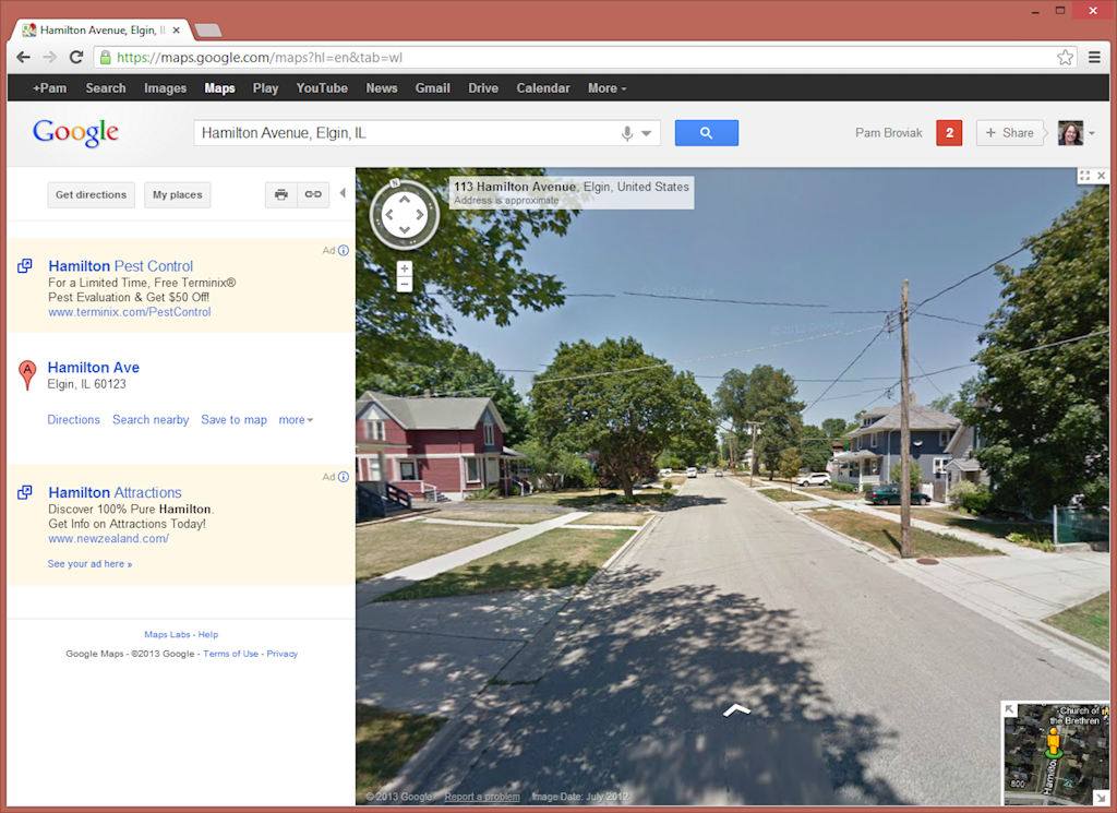
I was preparing a submittal for a project to be reviewed by a state agency and needed some photos of the street where the project was located. For this particular submittal all I needed was a general photo of the street that would show it was a typical asphalt roadway in a residential area. At first I looked to see if there was one available on the computer, but no luck. Just as I was wondering about having to go out and take some photos, I thought about using street view to see if that image would work. So I went into Google maps and dragged the little orange guy down from the upper left of the map to the road where I needed the photo. It was the perfect photo for my purpose. Using an example of an address in a neighboring city, I figured I would walk you through what I did and what I found. Here's how it looks when you zoom down to street view:

Google Street View

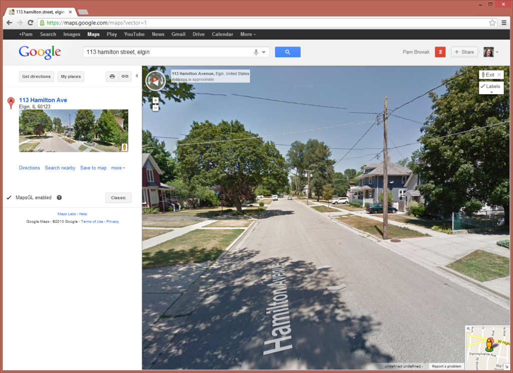
Now, that's a nice simple image that shows perfectly the type of image I needed to submit to this agency. I also noticed that Google offers an updated version of Google Maps called MapsGL so I switched over to that to try it out. You can see the difference below. One nice addition is the road name displayed on the roadway:

Google Street View MapsGL


So just as I was trying to decide what program to paste this screenshot into for preparing an exhibit for the submittal, I noticed the print button. I figured let's see what it looks like – maybe I can get away with just using that. So I clicked the little printer icon and the following page was created.

Google Street View Printout

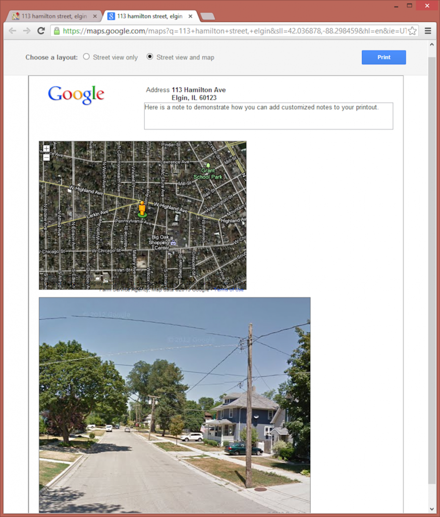
Wow – I thought, that looks pretty good. Google already has set it up on the page in a professional enough looking manner that I can just use that. They show the location and even offer the ability to type my own note and add any information the agency might need. (As an aside, I also noticed it looks like the latitude and longitude are displayed in the URL so if you needed that in the note, you could also copy and paste it from the URL.) But just as I was getting ready to print this from my browser, I noticed something else – Google offers another display option that includes the street view and a map. So I clicked the little button at the top of this page next to "Street view and map" and got the following:

Google Street View Printout with Map

How can you get better than that?! I have the perfect photo and a map all displayed in a simple and nice manner on a page that is all ready to print out by hitting that blue print button. Can it get any easier than that!? Maybe it seems silly to get so excited over something so simple, but for me, this saves the time it takes to go take a photo, download it to the computer, get it into a program, and create an exhibit. Sure it's not hard or difficult, but it does take time. I figured Google saved me at least a couple hours of my time the other day since I had four locations where I had to get this information. Doing it in this manner took only five minutes, and I have to admit, with the map, looks better and more professional than any of the past exhibits I have made for this same purpose. 

Go Google! Making us better engineers one little app at a time!

Share

Good FOIA Gone Bad

When I saw the map of gun owners printed online by a publication owned by The Gannett Company and the public reaction, I thought of my last supervisor. He was a wise man with whom I could discuss any idea without fear of ridicule or repercussion. When the ideas were good, he would fully support their implementation. When the ideas were bad, he would not hesitate to share why he thought so in a way that was not negative or discouraging. And in the end, I found his judgement in almost everything to be spot on. While we never discussed publishing the names and addresses of gun owners, we did talk about doing this for ordinance violators – people who had run down homes, etc. And this was one of those ideas he thought would be bad. He just thought it was going a little too far; people would not tolerate seeing their name and address publicly displayed for something like an ordinance violation. It's one of those examples where you shouldn't do something just because you can. Based on public reaction to the gun map, it appears he made a good call.

Of course, I see this as fallout from the FOIA laws, and it shouldn't surprise anyone that newspapers were the primary lobbyists for those laws. People are quick to defend FOIA because of the need for open and transparent government, and I agree we do need FOIA for those agencies that are not open and transparent. (Although when you do have an open and transparent government, FOIA actually slows down the process and causes more problems than it helps, but that is another story.) The reason FOIA is part of this problem is it does provide for full disclosure of all government information pursuant to the law yet has little language indicating what can be done with that information. And government has a lot of data on citizens, more so than people probably realize. So the map becomes the example of how this can go so very wrong and demonstrates the need to change FOIA laws so people act responsibly with the information they receive. Particularly when it involves personal information about citizens.

Some of the fallout from this has led to someone posting personal information easily found on the Internet about those involved with the printing of the map. The information can be found in an article, Sauce for the goose or, home address and phone number of Journal-News publisher. Of course, much of the information has since been removed by these jounalists because I imagine they do not want public scrutiny of themselves.

While turning the tables on people might help them better understand the repercussions of their actions, it doesn't solve the problem that FOIA laws provide the gateway to personal information with few to no limits on its use. Fortunately a New York State Senator, Greg Ball, has decided to take action. According to a press release on the New York Senate site, he "multi-sponsored Assembly bill 820, legislation which would prohibit the public disclosure of information in an application for a pistol license with exceptions for prosecutors and police conducting an active investigation." While this might help gun owners in that state, I hope that at some point, legislators everywhere realize this could occur with any personal information the government stores. And legislators should discuss and decide if it is better to change laws to restrict the release of personal information regardless of the purpose for which it was collected or to regulate the use of that information.

Share