Infographic of the Month – February 2015 – Running Gear

If you start a running program for your employees, one of the typical questions that eventually comes up is "what do I wear when running?" While we could find many articles written about this topic, we couldn't find a good, comprehensive yet simple graphic that seemed to put it all together. So we created one for our Health Hood program and are highlighting it as this month's featured infographic. If you have your own employee health program feel free to use the image for your own program or grab the embed code below the image to display the infographic on your own website. And keep checking back as we continue to create more resources for employee health and wellness programs – you can also like our newly created Health Hood Facebook Page!

As a side note, there are apps available that you can use to find out what clothing to wear based on the temperature. My favorite one so far has been the "What Should I Wear Running" app by Runner's Ally. You can get the link to either the app on the Android or Apple store at the What Should I Wear Running website. Runner's World also has a form on their website you can fill out to get clothing suggestions based on temperature, precipitation, wind, and several other factors.

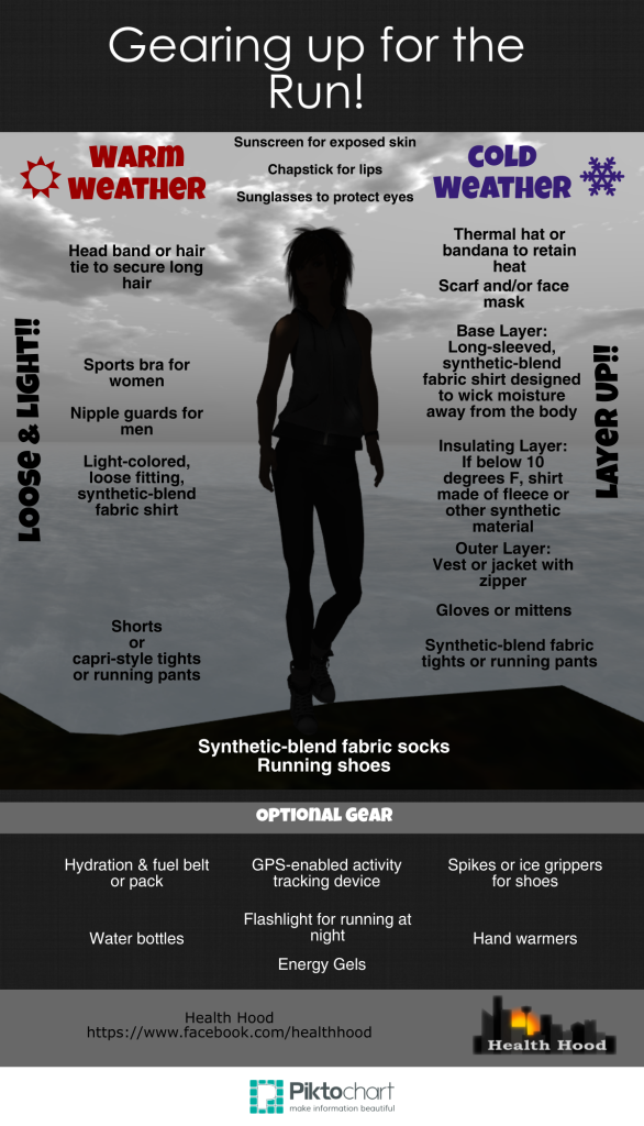
 

Gearing up for the Run Infographic

Share this Image On Your Site

Share

Infographic of the Month – March 2014 (FEMA Flood Maps!)

This month's infographic comes from FEMA – our friendly folks who work to keep us safe and help us when there's a disaster. One of FEMA's tasks is to develop flood maps which show us where flooding is most likely to occur. There's a lot that goes into determining flood boundaries and making these maps so FEMA prepared an infographic to help us better visualize the process. Because this infographic is produced by the U.S. government, there is no copyright. Therefore, any agency or company can print this out to either create a poster to hang in an office to show people who have questions about the process or to print out and make available to citizens as handouts. 

You can always find out more about this process by visiting the FEMA website: http://www.fema.gov/blog/2014-02-21/what-goes-flood-map-infographic


FEMA Infographic - Flood Mapping Process

Share

Infographic of the Month – February 2014 (Snapchat!)

Over the last month or so I've gotten several inquiries from people who were wondering about Snapchat – a newer social media tool most often used as an app on a mobile device. The idea behind Snapchat is for you to send an image with or without a message to either all of your followers or a select few. What makes Snapchat different than other social media tools offering similar capabilities is that the image disappears within a given amount of time. So the only way someone can archive it is to take a screenshot of it. While I admit to not using it a lot myself, I'm familiar with it because my kids use it constantly to send photos and texts to their friends, and the younger people at work use it to communicate sometimes instead of texting. 

As you can see from the infographic it is a great tool to reach out to the teen crowd. If a public works agency or industry brand wanted to launch an educational campaign targeted at that age group, it might be worth checking it out.  My concern with promoting it as a communication tool for government agencies is that the message/image is not archived. So I am not sure the use of Snapchat would allow us to meet laws that require storage and retreival of our communications.

I could see a private firm or company using it to send photos of an inspection or field check if the purpose was to only give those in the office a quick view of the site. But because the image would not last, those receiving it would have to make sure to take a screenshot and save it if those images were needed for later referral. 

If someone out there has been successfully using it in engineering or public works, send us the info, and we'll post it on the blog!


Snapchat Infographic


Brought to you by Social Marketing Software by Marketo


Share

Infographic of the Month – September 2013

This month we have a bike-related infographic supplied by Online Masters in Public Health. Whether it's to improve health or save money, people seem to be hopping on their bikes more than ever. And cities and states are working to accommodate these increased demands for bicycle facilities. As the Infographic shows, one initiative experiencing great success throughout the U.S. is bike sharing.

An infographic by the team at Online Masters In Public Health

The Public Works Group tries to highlight at least one infographic a month related to any public works topic. So if you've got 'em, send 'em!

Share

Infographic of the Month – July 2013

Several years back Waterloo, Ontario, Canada, started discussing the installation of a light rail transit system. Snapsort, a tech company based on that community, supported that proposal and came up with this infographic to help educate people about light rail transit. It's a good example of how agencies can use infographics to educate the public about proposed projects.

(If you want to learn more about the project, you can check out the Region of Waterloo's Rapid Transit Website.)


Waterloo Region rapid transit options
Snapsort's LRT for Dummies Infographic – See more at: http://blog.snapsort.com/2011/05/11/lrt-for-dummies/#sthash.itroLf60.dpuf


Share