Know your Risks – Week 1

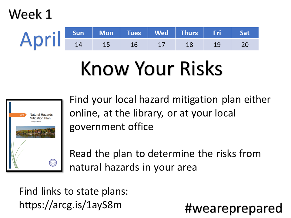
This is week one, and we are starting by looking up our local hazard mitigation plan so we understand the risks we need to plan for.  The Federal Emergency Management Agency (FEMA) publishes an online map where you can check the status of your State’s plan and see if your county has a plan. Some states also have links on their websites to local plans. But if you can’t find your local plan for your city or county through this online map or through the state’s website, you can always call or email your local emergency management agency or police or fire departments and ask them where to find the plan.

Know Your Risks


Most plans are organized in a similar format. Below I’ve highlighted some of the important information and sections in your plan to check:

Did my community participate?

If you live in an incorporated area, find your county’s plan then check to see if the incorporated area in which you lived participated in that plan. For example here is the link to my county’s plan: Kane County Hazard Mitigation Plan. 

In our county’s plan, there is a listing on page 1-9 of the communities which participated, one of which is the community where I live. You can check your own county’s plan in a similar way. If you have access to a PDF of the plan, then you can quickly find the name of your community by hitting CTRL-F then typing in the name of your community and hitting ENTER to keep moving through the document for each mention of your community. If your community’s name is not there, then it may not have participated in the plan. But even if they did not participate, your county’s plan and even your state’s plan can explain the hazards which may impact your area.

History and Risk of Disasters

The first part of these plans typically give background or a history of natural hazards in that specific area. For example, in my county’s plan they list the years floods, blizzards, and tornadoes hit our area. In addition to looking at historical data, the plan analyzes the risk for future hazardous events. Again for my area, severe storms seems to be the hazard with the most severe risk. There is also an anticipated high risk of flooding and tornadoes.

The plan then looks at what can be done to address these risks and minimize their impacts to our area. For me, as a resident, I am interested in learning from the plan if my location increases my risk. The plan shows locations of floodplains, hazardous material storage, hospitals, emergency response facilities, schools, and critical transportation facilities like bridges. These are things I need to know to plan for how I could be impacted in a disaster and where I might be able get help or how I would evacuate if necessary.

National Flood Insurance Program

This particular plan also discusses the National Flood Insurance Program or NFIP and its implementation in our county. The reason this is important to me as a resident is if I either live in the floodplain or if I am at risk of flooding, having flood insurance can greatly increase my ability to recover from a flood. We will cover insurance in more depth in a few weeks. So the main thing we want to do this week is find out from our local government plan if our community participates in the NFIP and Community Rating System (CRS). I can tell from our plan, our community participates in NFIP, but not the CRS.

How is my community minimizing risk?

The majority of a community’s plan is focused on what the local government entity is going to do to minimize impacts from hazards. Fortunately in our county’s plan, there is also information an individual can use to minimize impacts on their own property. For example, Chapter 5 of their plan focuses on protection of property and explains different solutions which can be implemented. Next week when I am assessing my own risks and trying to determine what I might be able to do to prepare, I can refer back to these ideas. I also know from this how my local government might be able to help. For example, if my home regularly floods, perhaps I can contact my local government for assistance with either elevating my home or ask if they can apply for a grant to acquire and demolish my home. This would allow me to move to a safer area with less risk of flooding.

Forecasting and warning systems

There is also a section in our plan which explains the forecasting and warning system for each type of hazard. I need to know this so if I am under threat I know where I should look for information or how I will be warned of a risk. Most of us are familiar with tornado sirens, but our community also sends out warnings through a cell phone service and television and radio announcements. FEMA also has an app you can download which will let you know when bad weather is forecast for your area. I already have the FEMA app on my phone and have signed up for local alerts through our community’s website.

Download the FEMA app

There can be a lot of other elements or information to the plan. Your community’s plan may also have additional information not covered above. While you don’t have to read every word of it, it’s good to at least go over the sections I noted above since this information will help us next week as we develop our own plan.
Share

Are You Prepared for the Next Disaster?

Are You Prepared for the Next Disaster?

We often hear from emergency response professionals that right after a disaster it may be a few days before anyone can assist us and during that time we may need to rely on  ourselves to survive. So having everything in place ahead of time can ensure we make it through a disaster and that our recovery is quicker.

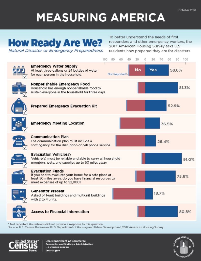
Even knowing this, according to the 2017 American Housing Survey, only half of U.S. residents report having enough supplies set aside for an emergency. There are probably many reasons not everyone is prepared including the cost and time to organize everything needed. The task may also seem overwhelming or not necessary.

Results of readiness survey

If you’ve ever thought about building a preparedness kit for yourself, but one or more of these reasons kept you from doing so, then join me this year in putting one together. Maybe if we all work on it together it might help motivate and encourage all of us to get it all done.

I’ll be posting my progress here along with on Facebook and Twitter so make sure to check it out and share your own progress!


Join me in 20 weeks to preparedness

Share

Comparing Bike Share Experiences: Carmel Bike Share

This is the second in a series of comparing the bike share programs in Columbus, Ohio, and Carmel, Ind.

Carmel Bike Share, Carmel, Indiana

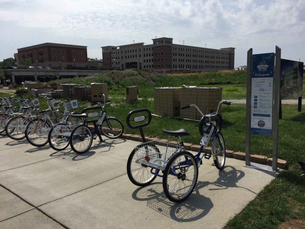
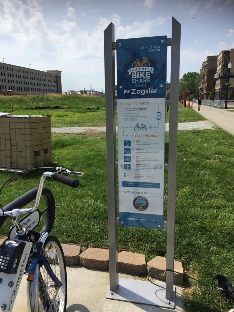
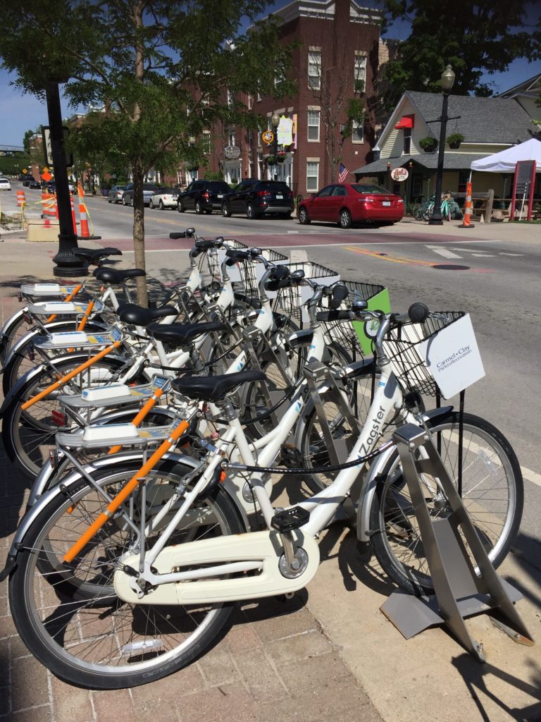
The bike share program in Carmel, Ind., is operated by Zagster, a company which offers more than 200 programs in 35 states. The setup is much different than other bike shares I’ve used over the years so I was very interested in trying out this program. Instead of a kiosk and a bike docking station used by programs in many major metropolitan cities, the Zagster setup consists of a set of locked bikes at a station with an information board explaining the program. Payments and locking mechanisms are controlled through a smartphone app.

Carmel Zagster Bike Share Program Station
A Carmel Zagster Bike Share Program Station

Program Summary

To use this type of bike share program, you need to install the Zagster app on your mobile device. If you don’t have the ability to download apps, you can arrange for payments and unlock bikes using text messages.

There are currently three payment choices:

  • Annual membership at $30 a year which includes free trips which are under an hour. After the first hour, users are charged $3 per hour up to $24 per ride.
  • Monthly membership at $15 per month which includes free trips which are under an hour. After the first hour, users are charged $3 per hour up to $24 per ride.
  • Pay-as-you-go which costs $1.50 every 30 minutes up to $24 per ride.

In all cases, if a bike is kept for more than 24 hours, users will be charged an over time fee of $24.

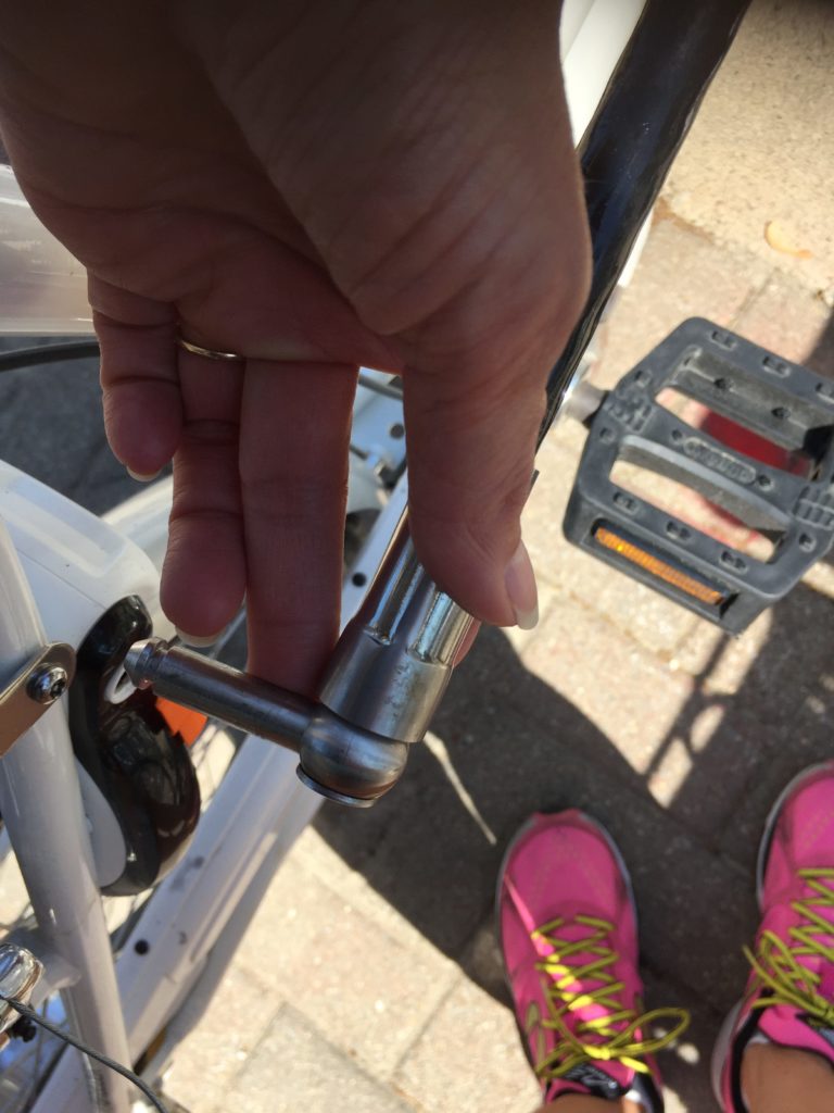
To use a specific bike, you find the bike’s number from the bike and enter it into the app. If the bike is available, you will be given an unlock code. This code is entered into the key pad on the bike. Once the bike is unlocked, you can remove it from the docking station. To return the bike to a station, you just park it and press and hold the lock button on the keypad until the light flashes. Then you find the orange tab on the lock and slide it down and place the docking cable into the port on the lock. Finally you tap “End Ride” in the Zagster app.

At the station in Carmel, there were two different types of bikes available: a “cruiser” and a “trike.” Both bikes had baskets.

Carmel Bike Share Program Information Board

My experience

Having only used the more traditional type of bike share program, I was a little hesitant in trying this one out. Fortunately this time, I was able to do so with my partner which was a great help and expanded our experience. For example, I had no problem downloading and using the app. But while my partner was able to download it, he could not get the app to give him the code to unlock the bike. So he used the text option to get the code which worked great. If he had not been with me, I probably would not have been able to see how the text function worked.

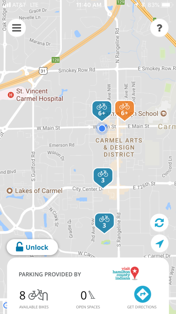
So we installed the app and went to a bike share station in the Carmel Arts & Design District. This is an example of how the map on the app looked for that area. You can see it is showing eight available bikes and no open spaces at the station colored orange which was on Main street and to the east of us. We also checked the one closer to us, and it showed seven available bikes with five open spaces.

Screenshot of Zagster app on iPhone.


One thing we discovered right away was even though there were several bikes shown as available and several bikes locked into the dock, once we went to the screen to choose the bike and get the code, fewer bikes were actually available. I was wondering if this is because some of the bikes were still “checked out” on rides and only temporarily locked there by the users.

We eventually found two bikes, each of us bought a ride, and received an unlock code. The locking and unlocking process wasn’t obvious to us, but we did manage to eventually figure it out. Below is a photo showing how the bike is connected to the station.

Connection locking the bike to the docking station

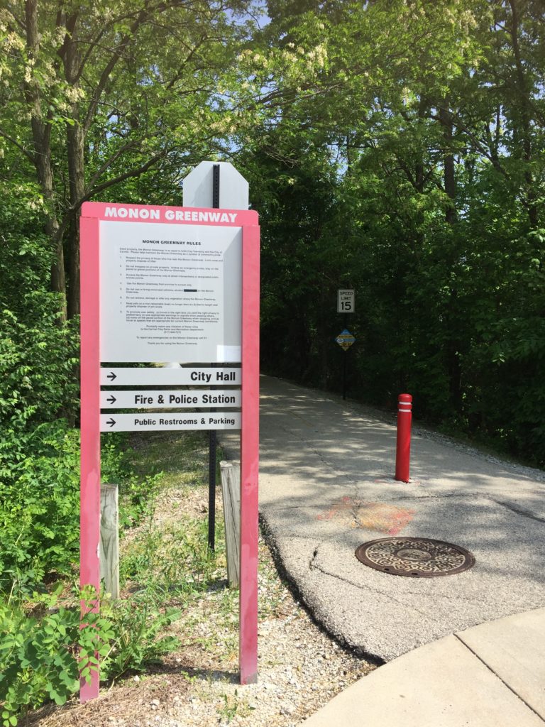
Once we got going, I was looking forward to a long ride since we didn’t have to worry about returning a bike in a specific amount of time. We could keep it out for a couple hours and just pay the total cost for that time. The station where we picked up the bike was right along the Monon Trail so we began biking south along that path. It didn’t take long before I realized the bike I had was making a strange and annoying noise. I tried recording it – you can watch it by clicking this link:  Bike Noise Video

So there was no way I could stand listening to that for two hours. Fortunately there was another station a little way down the path so we stopped there for me to return the bike, pay the $1.50, and pick another bike that I hoped would offer a more silent ride. After getting it unlocked and starting off again down the trail, I was happy to find out this one made no noises. After our ride we went back to the Arts & Design District and  returned the bikes.

Monon Greenway Bike Trail

While the access process took a little getting used to and we had that noise issue not only that time but also the next time we used the service, overall the experience was still positive. I would definitely use the Carmel Bike Share program again. Here’s my list of pros and cons from the perspective of a visitor, not a resident:

Pros

  • The best aspect of this system for me is that bikes do not have to be returned to a dock within a specific amount of time. This offers a lot more flexibility for users in choosing their routes.
  • The cost was very reasonable.
  • Bikes can be locked anywhere so users can stop along their ride to eat, shop, or explore. We saw users along the trail who had done this and were eating at restaurants along the trail.
  • Once I got a bike that worked, it was easy to ride.

Cons

  • The main issue for me was that twice we had problems with the bikes. While the cost to pay for another ride wasn’t much, it was annoying having to return the bike to a station and hope out of the few available bikes there, I would get one that would not make a noise.
  • The actual number of available bikes seems to be less than what appears in the docking station and on the app.
  • The setup and process to getting a bike takes some time to figure out.
  • A person cannot check out multiple bikes. So if you are riding with someone they need to get a bike on their own.

In comparing the two systems, I definitely prefer the Zagster bike share program. Yes there were some maintenance issues with the bikes and figuring out the process took some time. But not having to worry about getting a bike back to a station in 30 minutes made it definitely worth putting up with those other things. Also, the cost was very reasonable.

Carmel Bike Share Program Docking Station


Share

Comparing Bike Share Experiences: Columbus CoGo Bike Share

A couple months ago I was able to spend some time in Columbus, Ohio, and in Carmel, Indiana, a city just north of Indianapolis. Since I had some time to explore at night and on the weekends, I decided to try out the bike share programs in each community. Each offered a much different experience which I thought would be a good idea to share here. This post highlights my experience with CoGo Bike Share in Columbus. I’ll follow up with a post about the program in Carmel, Indiana.


CoGo Bike Share, Columbus, Ohio

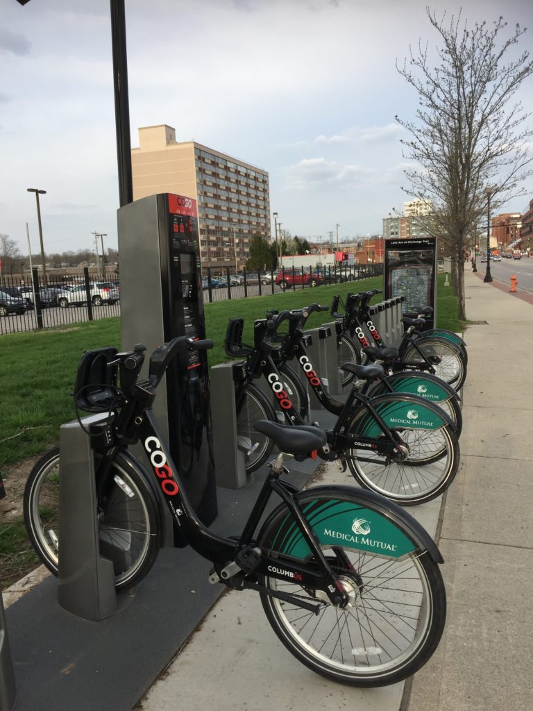
The CoGo Bike Share in Columbus is operated by Motivate, a bike share company which partners with governments and brands to offer bike share services across North America. The setup in Columbus is similar to that offered in many other major metropolitan areas -a network of stations with bike docks and payment kiosks located throughout a given area.

Program Summary

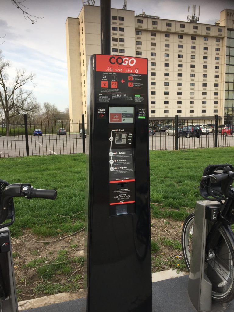
Payment is made through either an annual subscription, a day pass, or a 3-day pass. Each type of payment covers a 30-minute ride after which the user must return the bike to a station or pay a fee for each additional 30 minutes.

CoGo Bike Share station in Columbus, Ohio

In Columbus, a membership is currently $75 while a day pass is $8 and a 3-day pass is $18. All include unlimited 30-minute rides, but if the bike is not returned in that 30 minutes, the $3 fee is applied. So basically to ride the bike for longer than 30 minutes with no extra fees, you would need to pick up a bike, ride it to another station, and return it in less than 30 minutes, and then arrange for your next 30-minute ride.

The bikes are locked in a dock at each station as shown in the photo above. So to unlock the bike for use, you use the code you are given when you pay for your day pass. To use another bike after your first 30 minutes, you just reswipe your credit card at the kiosk and request another code. If you have an annual membership, you are given a key which is used to unlock and access bikes.

The Transit app for mobile phones can also be used to provide maps of stations and availability of bikes. People can also use this app to purchase passes and generate codes.

My experience

Because I was staying in Columbus about 10 days, I figured I would try out the bike share program to see if I could use it to get around and at the same time get in some exercise. My hotel was conveniently located near the Olentangy Trail roughly a mile north of the nearest bike share station. So I walked to the station one night, bought a day pass, and took off down the trail.

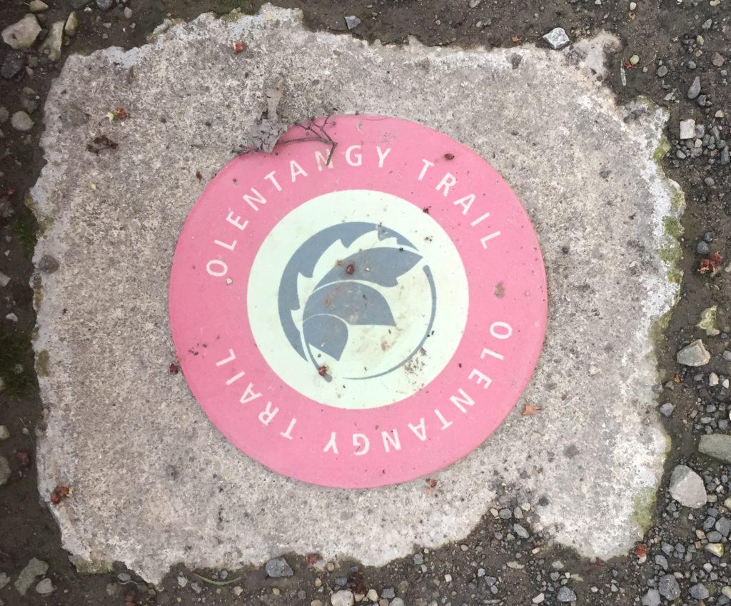
Olentangy Trail Marker

My idea was to try to bike to German town via the trail since I prefer to follow a trail rather than ride in traffic. While the ride was great, as I neared the 30-minute mark, I realized this was a bad idea. There are no other stations near the trail until you get to the downtown area which I found was not a 30 minute ride for me. Part of the problem for me also was when I reached Goodale Street, there was no signage to tell me which way to take to get to the rest of the trail. So I did waste time at that intersection wondering what to do and wandering around somewhat. My phone was not really a big help either. So I turned around and tried to find the nearest station where I could drop off the bike and pick up a new one. I barely made it in time to the one at 3rd and Michigan which was about 5 or 6 blocks from the trail. After getting a new code and picking up a new bike, I headed back to the original station, dropped off the bike, and walked to my hotel along the trail.

CoGo Bike Share Pay Kiosk

This experience might be totally different for a resident or a person who loves biking in traffic or someone very familiar with Columbus. But because I was a visitor with minimal knowledge of the street system who prefers trails, I came away with this list of pros and cons:

Pros:

  • Relatively easy to figure out the pass system and buy a pass.
  • Also easy to get a code and unlock a bike.
  • From what I could tell, there were always plenty of bikes in all the docks.
  • The bike was easy to ride and in good mechanical condition.
  • I view the fact that there is even a bike share program available as a huge positive for Columbus.

Cons:

  • The stations were not located in areas near to where I prefer to ride.
  • Station locations and the 30-minute time limit minimizes the time which can be spent riding along off-road trails.
  • The 30-minute limit creates the need to strictly plan a route to ensure bikes are returned on time.
  • The 30-minute limit also minimizes the ability to stop and explore unexpected sights or attractions.
  • Definitely does not allow time for getting lost.

I would like to try it again if I was staying in the downtown area and compare that experience to the one I had this year. It seems like it might be a lot different since the bike network is more dense there. If I get a chance to do that in the future, I’ll try to follow up and post something about it.


Share

Is it Really Climate Change or is it Sewage?

Fox River Sept 2015
Fox River Sept 2015
Fox River Sept 2015

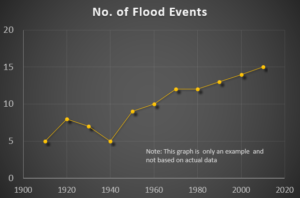
Lately I’ve seen several presentations which all include a similar slide with a graph like the generic one I created below. All the presenters then refer to the graph on the slide and make a statement similar to this: “and because of climate change you can see an increase in flooding over the last several decades.” But with no supporting data ever offered to attribute this trend to climate change, these graphs have instead made me think the cause is most likely sewage.

Graph - for example only; not based on actual data
Graph – for example only; not based on actual data

So how do I get sewage out of this? Well, first it helps to have a background in the history of water distribution and wastewater treatment in the U.S. While some major cities began piping water to homes in the 1800s, construction of water distribution systems didn’t began in most areas until the early 1900s.  At this time, wastewater in most areas was still discharged without central collection or treatment. According to Urban Wastewater Management
in the United States: Past, Present, and Future, “By 1905, more than 95 percent of the urban population discharged their wastewater untreated to waterways. Little changed over the first quarter of the twentieth century,
and in 1924 more than 88 percent of the population in cities of over
100,000 continued to dispose of their wastewater directly to waterways.” Because this led to a non-centralized system, sewage was sometimes sent directly to a stream from multiple outlets and sometimes dispersed over land to eventually make its way to a stream.

All this began to change in the mid-1900s. The same publication cited above also noted Congress enacted  “the Water Pollution Control Act of 1948. The legislation provided for comprehensive planning, technical services, research, financial assistance, and enforcement. The Water Pollution Control Act was extended in 1952 and became permanent legislation in 1956.” There was a 1965 amendment to this act, and then eventually in 1972, Congress passed another Water Pollution Control Act.  The paper points out “the 1972 Act set the unprecedented goal of eliminating all water pollution by 1985 and authorized expenditures of $24.6 billion in research and construction grants.”

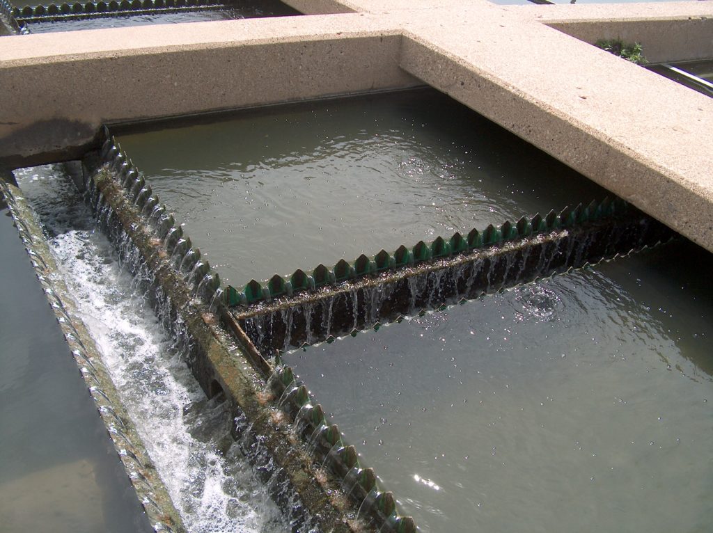
The result of this flurry of legislative activity between 1948 and 1972 resulted in the installation of centralized wastewater treatment systems in urban areas across the U.S. Today all discharges from each of these systems are regulated through permits from the USEPA primarily for water quality control. The discharges are typically introduced to a stream or other body of water directly from the treatment plant. Treatment discharges have the potential to range from less than 1 million gallons per day (MGD) to 1.44 billion gallons per day. That’s a lot of water entering our streams on a continuous basis which is why I immediately thought of wastewater as a cause when I saw the graph trending up after the mid 1900s.

Wastewater clarifier

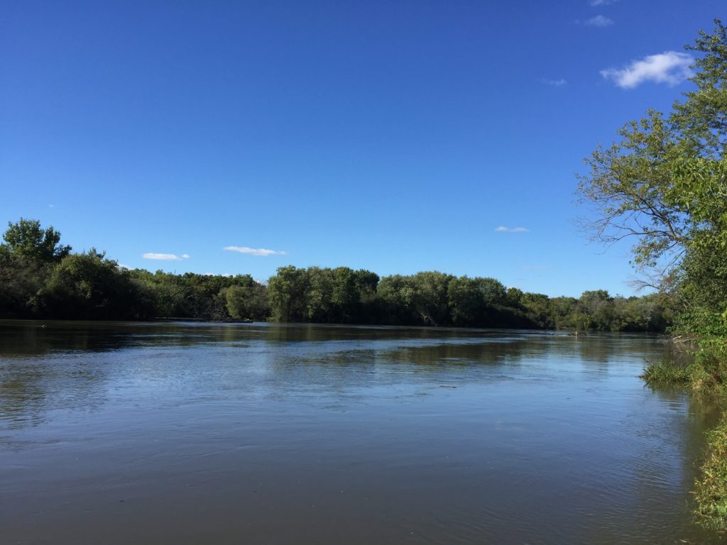
Another reason I suspected wastewater had a major impact on stream flow was based on something I heard regarding the river flowing through our city. It seems in the past, people could walk across the river in the summer. As you can see in the photo of this river which I included at the start of this article, walking across the river today would most likely never be possible. In hearing this, there was no question in my mind that this was due to the wastewater discharges which now regularly flow into our river  and increase its base flow.

So during the last presentation I attended, I asked if impacts from wastewater discharges were considered or analyzed to see how much these flows are contributing to increased flooding. I explained if prior to installation of wastewater treatment plants, base flows of rivers could reduce to almost nothing, these streams would have had more capacity to handle rainfall events. But now with increased base flow due to wastewater discharges, which really started entering streams between 1948 and the 1980s and continue to do so and increase, the ability of streams to handle rainfall events has decreased. This could be a cause of rainfall events impacting greater areas and resulting in increased damages in suburban areas.  Also, as this USGS site shows, How Much Water Do We Use?, public water supply usage has increased over the years which would increase wastewater discharges even more. The presenter said they had never looked at the impacts of wastewater discharges.

As I continued to wonder about this, I looked online to see if others had thought of the impact of wastewater discharges on flooding events and discovered yes, they have. I even found studies which were done on the river in my community. H. Vernon Knapp, senior hydrologist with the Illinois State Water Survey, has developed at least two studies for the Fox River in Illinois which related to this topic. In his paper, the “Fox River Basin Streamflow Assessment Model: Hydrologic Analysis, October 1988,” he  analyzes the river flow taking into consideration impacts from effluent discharges from wastewater plants along the river. According to Knapp, in 1988, “approximately half of the low flows in the river upstream of these plants originated as effluent discharges from other facilities. Under these circumstances, the capacity of the Fox River to assimilate the additional effluents should be of concern.” His paper is also informative regarding other factors which can impact stream flow.

More recently Knapp developed a presentation, Effects of Future Water Demands and Climate Change on Fox River Water Availability. In it he states “watershed modeling suggests that the potential effect of climate change on Fox River low flows is considerably less than the effects of effluents and withdrawals, and thus does not substantially alter the water supply potential of the river.” He also notes “low flows in rivers such as the DesPlaines are almost 100% effluent.”

Perhaps not all increased flooding in all watersheds can be directly attributable to increased wastewater discharges since the 1940s, but I’m surprised it’s not always at least considered. Instead increased flooding events have been attributed to climate change, yet I could find no study which directly proves this. Most studies only look at the extent of flooding and make the leap with no specific data to back up the claim that this is due to increased precipitation brought on by climate change. A few studies I found also indicated there are too many factors other than just precipitation, such as antecedent water content, soil type, topography, etc., to conclusively make a direct correlation between increased rainfall and increased stream flow.

In the future, I hope to find more studies which do take into account the impacts of wastewater effluent on river flow and flood events to see if others have findings similar to Knapp’s.


.

Share

ArcGIS Pro – My New Favorite Software

ArcGIS Pro ScreenShot of 3D Map

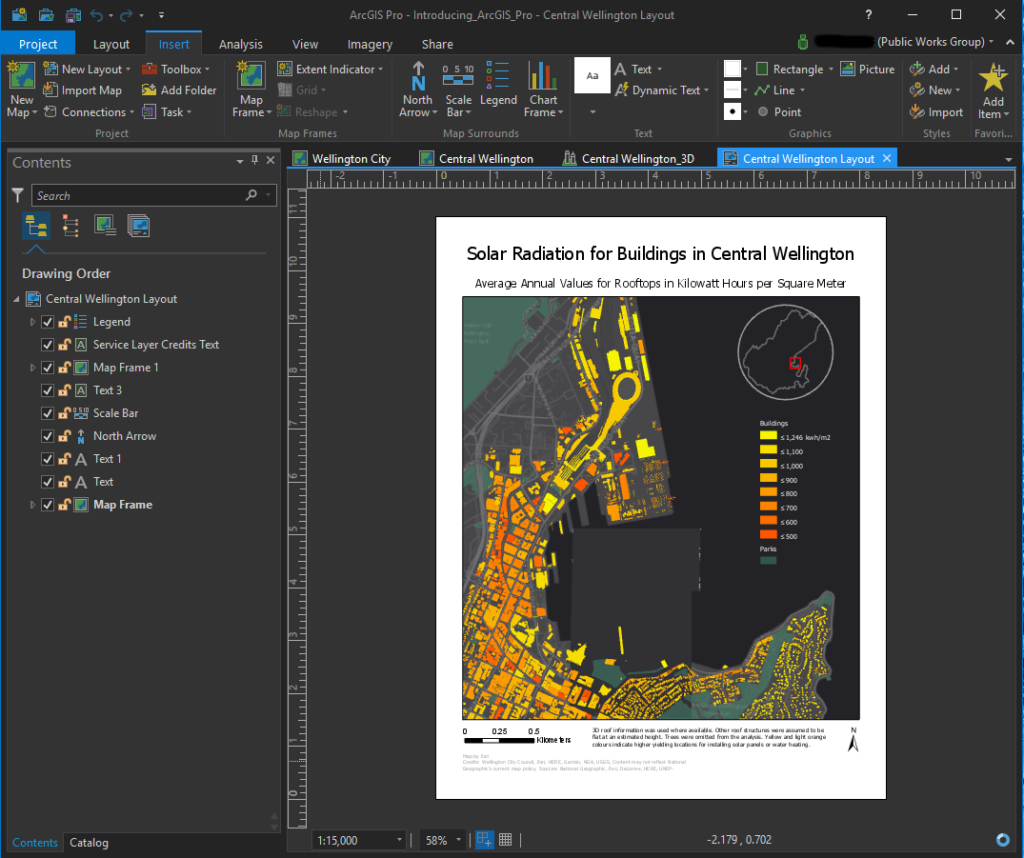
As a public works professional, one of the best things you can do in the new year is to check out ArcGIS Pro – a GIS mapping software by ESRI. I admit, like many GIS software products, ArcGIS Pro can be a little overwhelming to use right out of the box. Even though I am a regular user of ESRI’s older product, ArcMap, the user interface was nothing like what I was used to and the workflows somewhat different. But after trying it out for a few weeks, I have found ArcGIS Pro offers more effective features that increase flexibility, capabilities, and ease of use. It was definitely worth taking the time to figure it out.

If your workplace does not yet have a subscription, you can download a free trial to try it out. Because the new software is so different from past products, I went through the great tutorials ESRI has on their website to help me learn the software. After completing these trainings, I felt confident in making the switch to ArcGIS Pro for all of my GIS work.

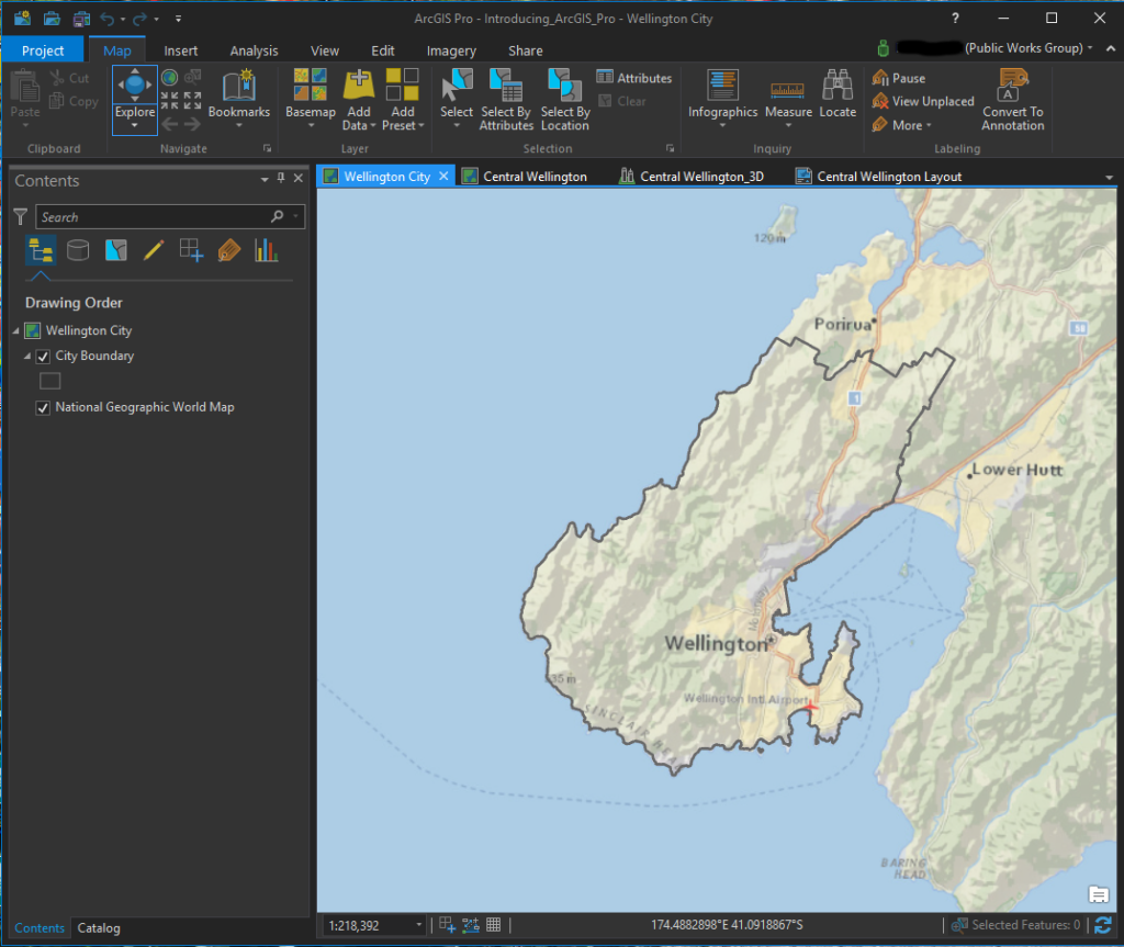
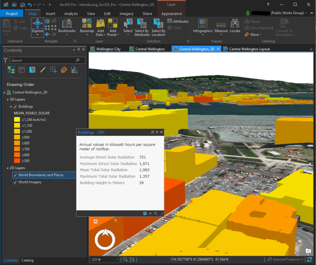
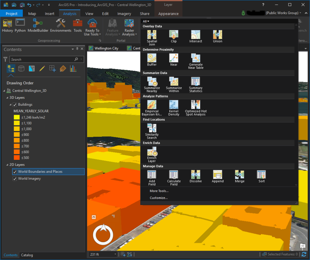
The best way to explore what ArcGIS Pro offers is to download the software and use it yourself so I won’t try to lay it all out here in this post. Instead I included a few screenshots from the tutorials so you can get an idea of the layout and look. The data displayed is for Wellington, New Zealand and is provided by ESRI for use in the tutorials.

In the screenshot below, you can see the menus are displayed across the top in a manner similar to other Windows-based products. A content window is located on the left and lists the data included in the map. When you start accessing other menus such as catalog or symbology, they will show up in this same space. Then you can switch between them by clicking the tab for each located at the bottom of the window. In this image, I only have the content and catalog menus open.

ArcGIS Pro ScreenShot of MapArcGIS Pro screenshot of a 2D map

You can also see in this image several tabs shown above the map window. This is because ArcGIS Pro allows you to create multiple maps and layouts as a project rather than just creating one map at a time. With this format it is easy to switch between maps and layouts and copy data from one map to another. In the image below, a layout for this project is displayed.

ArcGIS Pro ScreenShot of LayoutArcGIS Pro screenshot of a layout

The other feature I really like is the ability to easily create 3D maps. Below is another screenshot of a map showing buildings in Central Wellington, New Zealand. This map displays the same data as shown in the layout in the image above, but in a 3D format. I clicked on one of the buildings to get a pop-out window of the information stored for that structure. Also I had changed the basemap to get an aerial view which displays more of a picture of the ground.

ArcGIS Pro ScreenShot of 3D MapArcGIS Pro screenshot of a 3D Map with data displayed

Finally in the screenshot below, I had clicked in the Analysis menu to display some of the tools available. You can customize these display windows to show tools you frequently use.

ArcGIS Pro ScreenShot of Analysis ToolsArcGIS Pro screenshot of available tools in the Analysis menu
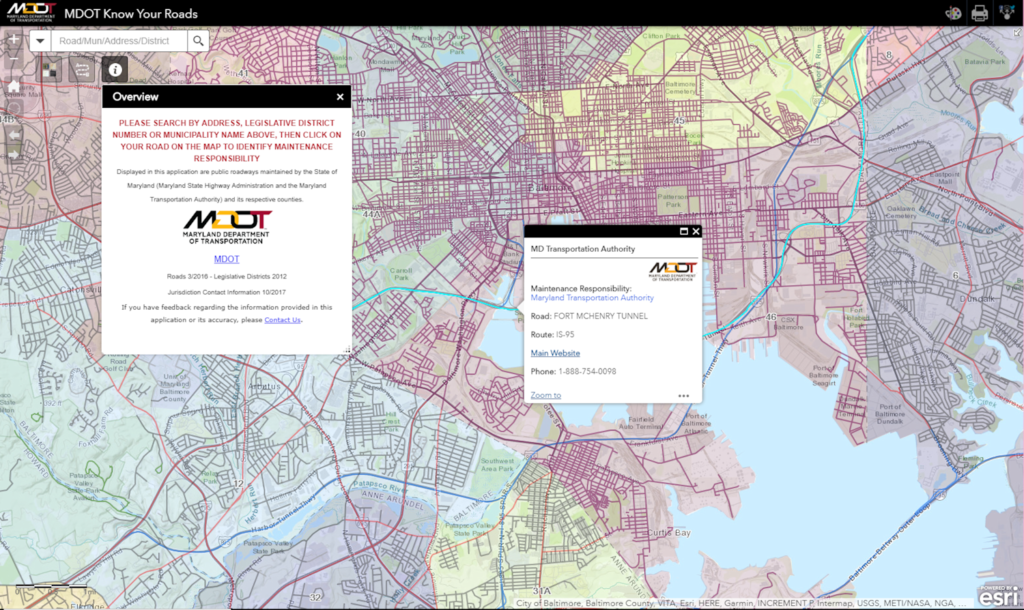
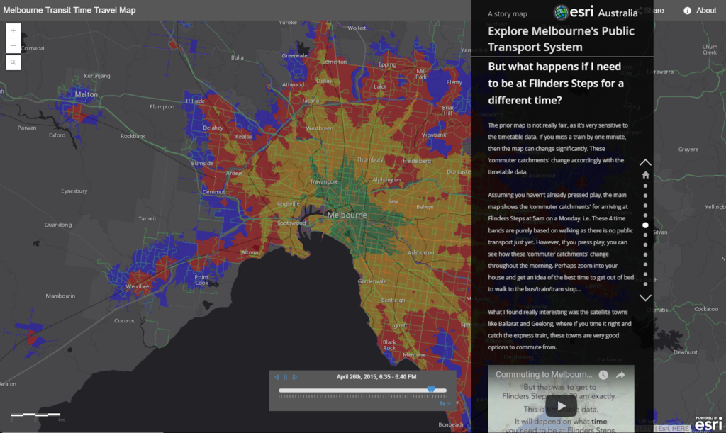
Another added bonus with ArcGIS Pro is the integration ESRI included between the software and ArcGIS Online. With the Share menu, you can easily copy your maps to your ArcGIS Online account where they can be displayed as web maps or used to create other applications such as story maps.

To give you an idea of why being able to easily share to ArcGIS Online is so important and powerful, I included just a couple examples of maps created and shared through that online service. The first is a very useful map created by the Maryland DOT. People can use this web map to figure out which entity has maintenance responsibility for any road in the state:

Maryland DOT Maintenance Responsibility Web Map

Another great example is this story map of public transit in Melbourne, Australia. This particular application displays a lot of the features and capabilities offered by story maps:

Melbourne Australia Transit Story Map

Finally, if your office doesn’t offer ArcGIS Pro for your own use or your free trial runs out, ESRI offers a fairly low-cost subscription option for people who just want access to the software for personal, non-commercial use. You can find out more about ArcGIS Pro for personal use here: http://www.esri.com/software/arcgis/arcgis-for-personal-use


Share